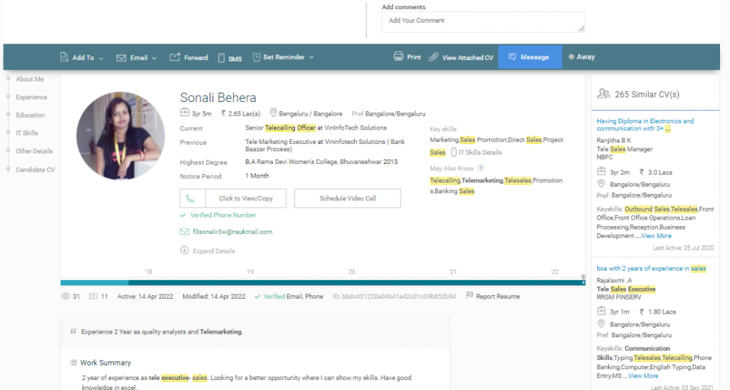
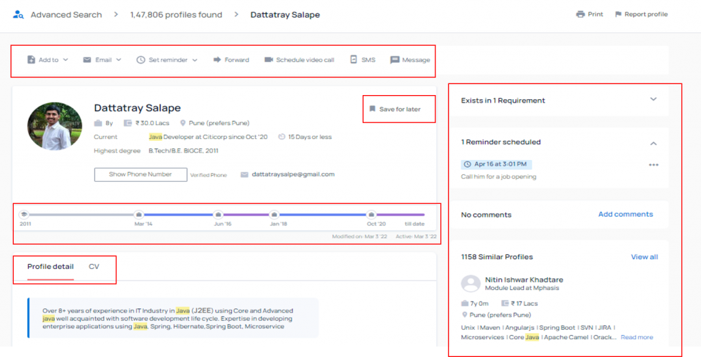
A good UI/UX design provides flawless user experience and improves productivity. With this thought, we at Naukri Resdex, have introduced a fresh new look of CV details page. Along with the new intuitive look, the introduction of new features will also improve the productivity of the user.
Limitations on the existing page (Based on feedback from users)
• The earlier view looked cluttered with too much of information
• Users unware of the call from App option
• Important actions not prominently placed
• Redundant information on the page

What’s New?
- Important and most often used actions like add to, emails, set reminder, forward, schedule a video call, sms and message are now placed upfront for recruiters to perform quick actions on CV. This will help recruiters improve their productivity.
- Recruiters can now have a synchronized experience with the newly introduced option of save for later. This option will help recruiters save a CV to view later as per their convenience from App/web.
- Recruiters can now have a bird’s eye view on a candidate’s profile with new easy to interpret view of the career timeline.
- Recruiters can now quickly navigate to the candidate’s CV which is now placed upfront next to profile details. This will help them save time and optimize their screening process.
- Collaboration within the team is now easier. Users now have visibility on team’s actions/comments on a CV, thereby reducing efforts on an already in-pipeline job seeker.
- Recruiters can have better efficiency as they can now call candidates directly with a single click without having to dial the number manually.

These enhancement will give users a great user experience, easily skim through the details of the candidates and take quick actions without wasting anytime time.
For any queries or suggestions, contact us at support@naukri.com.
